

Al Mirani Fort

Project Background
Al Mirani Fort didn’t need to shout for us to hear it—its silence was enough. It hinted, suggested, and inspired without a sound. From this silence began our journey to craft a visual identity that reintroduces the fort with a fresh spirit.
The project revives roots and redraws the site in a way that reflects pride, identity, and belonging, without diminishing the fort’s historic dignity or reducing it to a mere shape.
Stage One: Research and Reflection
We began with research and reflection sessions on:
- The architectural and military history of the fort
- Omani visual symbols in historical contexts
- Materials, colors, decorations, and protective patterns
- The fort’s function as a defensive site and a current cultural landmark
We delved deeply into the meaning of “fort” as a concept:
A fort is not just a building—it is a feeling of protection, a symbol of steadfastness, and a watchful eye over the sea and future.
Stage Two: Visual Concept Development
From the idea that the fort both guards and tells a story simultaneously, we crafted a visual identity consisting of:
- Solid lines: representing walls, stability, and protection
- Angles and curves: inspired by details from windows and staircases within the fort
- Circles and dots: echoing the round towers and lookout points
Stage Three: Design
- Logo:
- Designed to reflect the fort’s silence and grandeur, using lines inspired by the edges of walls, symbolizing protection and openness simultaneously.
- Colors:
- Stone gray: symbolizing the fort itself
- Sandy beige: inspired by its natural surroundings
- Copper accents: hinting at its rich history and old weaponry
- Dark navy: reflecting the depth of the sea and the fort’s eternal watch over it
- Arabic Typeface:
- We used a traditional Arabic font with a modern style, balancing rigidity and flow, reflecting the meeting of heritage and modernity.
- Patterns:
- Decorative patterns inspired by the ventilation openings and mashrabiya (traditional wooden latticework) of the fort’s buildings were developed and used as supporting elements in both printed and digital identity.
Applications
The identity was applied across various materials:
- Informational panels inside the archaeological site
- Printed guides (brochures & maps)
- Souvenirs (notebooks, bags, cups)
- Interactive signage for visitors
- Digital posts on official platforms


أعمالنا الأخـــرى
عرض الكل
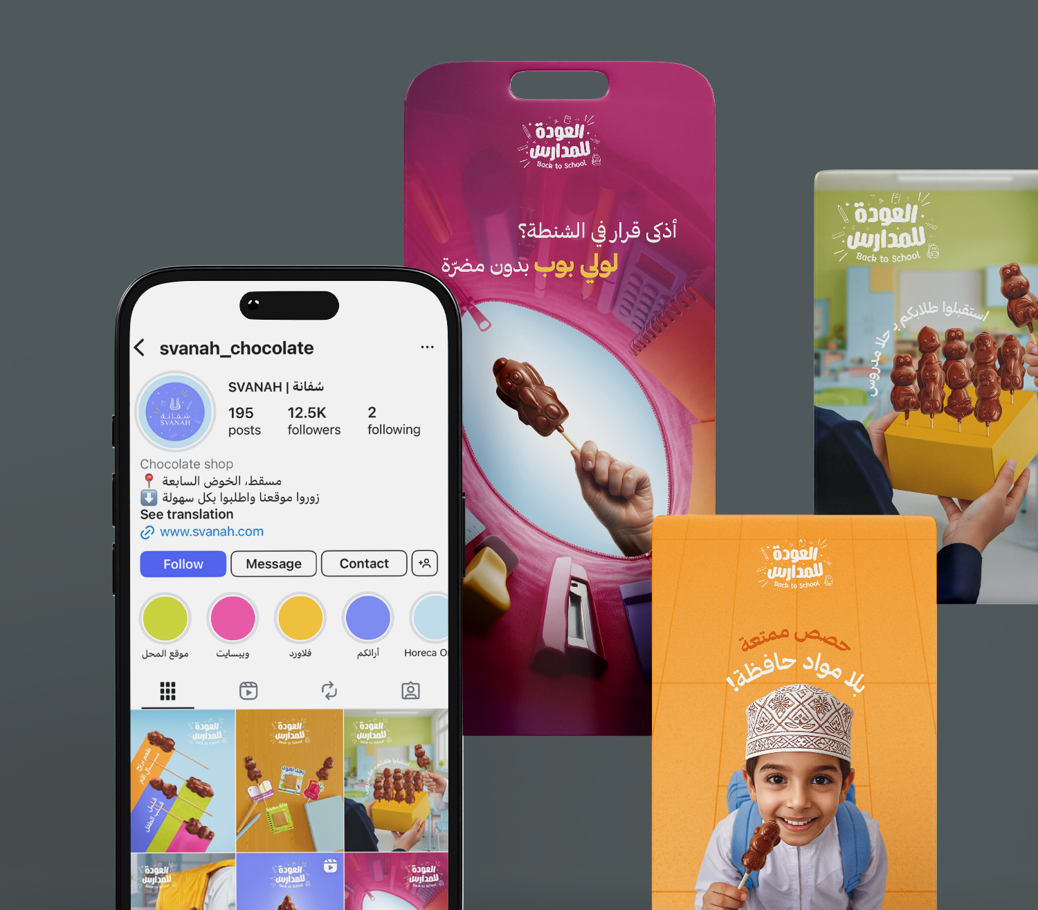
Back To School - Svanah
Digital Marketing, Photography, Graphic Design
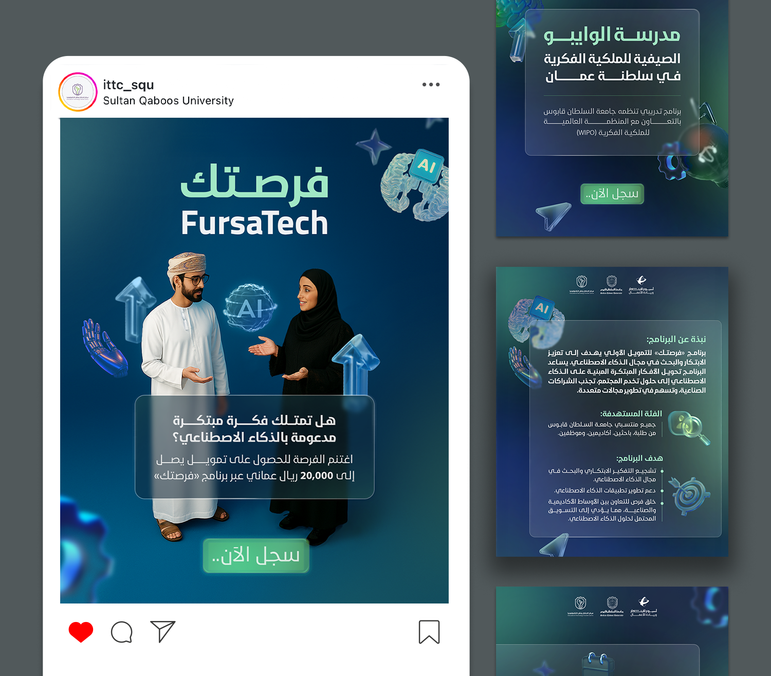
Innovation and Entrepreneurship Week
Graphic Design