

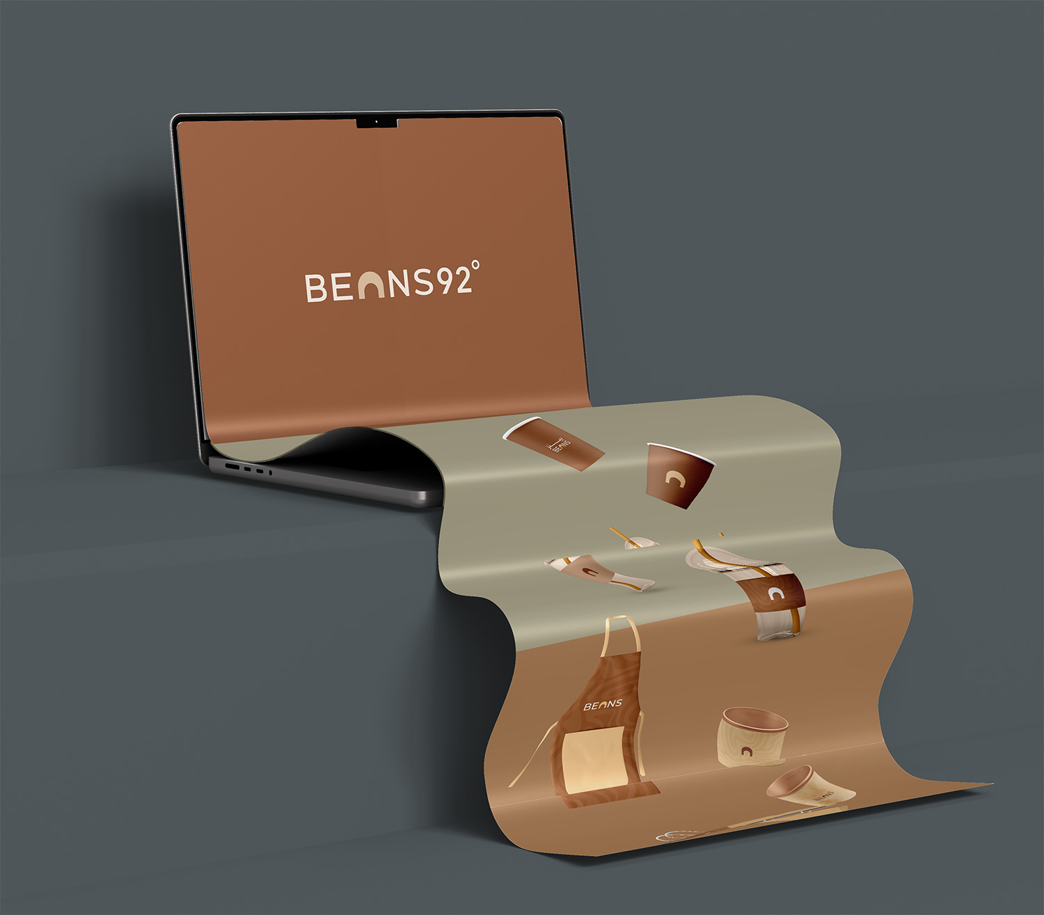
Beans 92
Project Background
Some places don’t just serve coffee—they deliver a feeling. In the heart of Wilayat Shinas, where traditional Omani architecture meets a touch of modernity, the journey to design the visual identity of Beans29 began.
We weren’t just designing a logo; we were trying to capture a feeling that flows from the walls of the place and lingers in the visitor’s memory.
Stage One: Listening to the Place
The building itself spoke the first sentence. Its curved corners, smooth lines, and the light gently pouring inside—all formed a silent visual invitation.
From there, we began extracting the identity’s features: the building’s fluidity inspired the logo’s icon, resembling the motion of steam or the warmth of a quietly savoring cup of coffee in a moment of calm.
Stage Two: Crafting the Colors
The colors didn’t come from a ready-made palette; they came from Shinas’ fabric:
- Sandy gold, like its earth.
- Deep green, from its orchards.
- Dark brown, evoking the slow roasted coffee beans.
Every color was carefully chosen to carry the essence of the place, not just visual harmony.
Stage Three: Developing the Logo and Identity
The logo summarized everything:
- Curves inspired by the building’s design
- Simplicity belonging to the world of coffee
- Depth reflecting Beans29’s character as a calm and cultured space
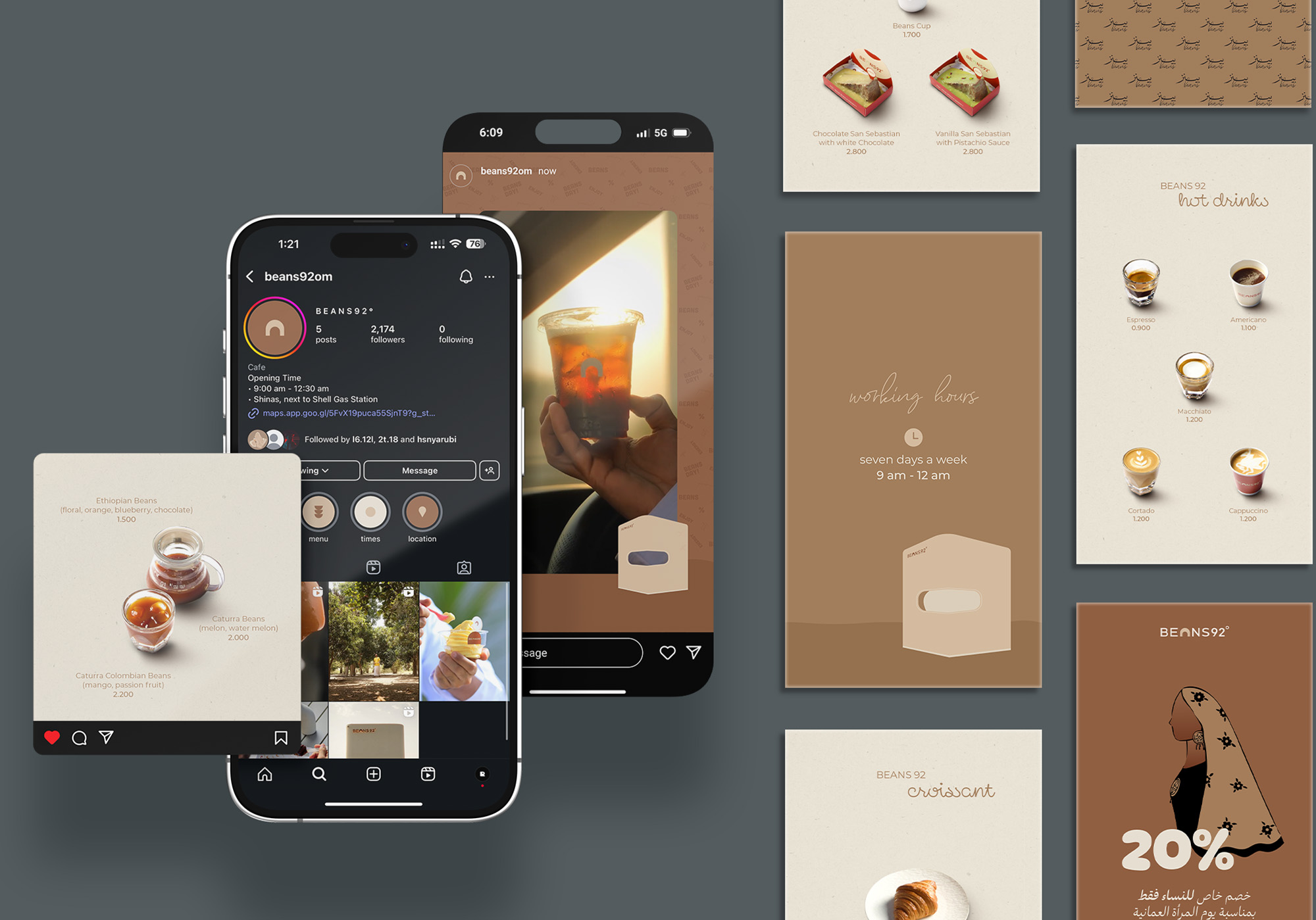
From the logo, the identity flowed into everything:
- Drink menus
- Packaging bags
- Store signs
- Visual communication patterns on social media
Even the words used in posts carried a tone expressing calm and warmth—like hearing soft music from a coffee cup.
Project Summary
Beans29 was not just an identity project. It was an emotional experience breathing through the walls and imprinting itself in the visitor’s mind as a beautiful memory.
We didn’t want it to be seen; we wanted it to be felt.

أعمالنا الأخـــرى
عرض الكل
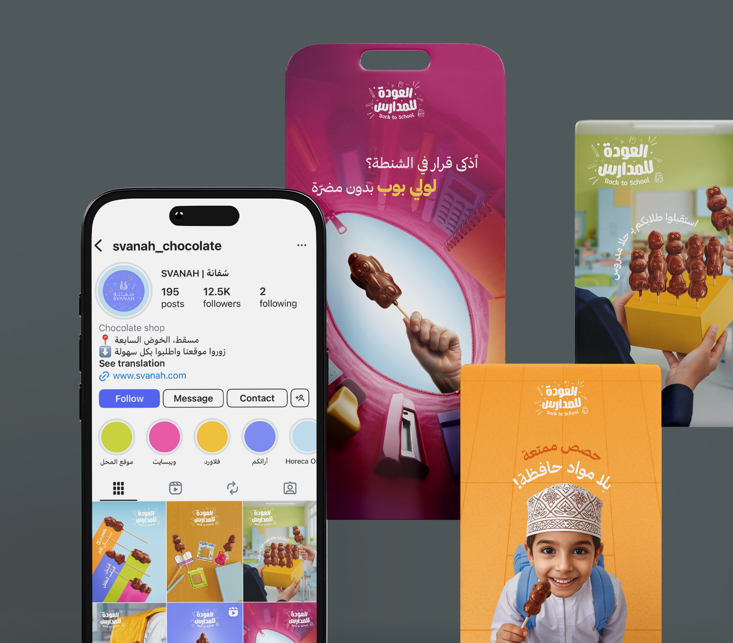
Back To School - Svanah
Digital Marketing, Photography, Graphic Design
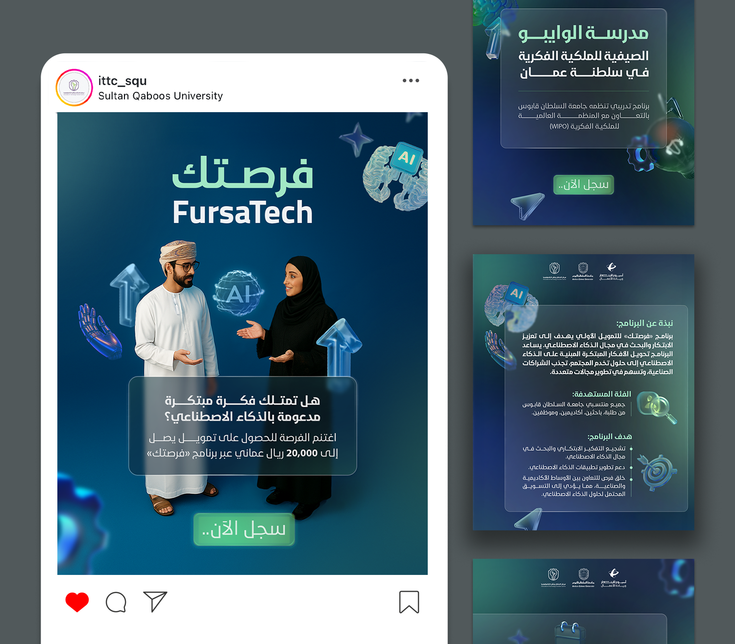
Innovation and Entrepreneurship Week
Graphic Design